

CORPORATE IDENTITY / CLASSROOM PROJECT
The Indian Space Research Organisation, ISRO, is the primary space agency of India. ISRO is amongst the largest government space agencies in the world. Its primary objective is to advance space technology and use its applications for national benefit.
ISRO’s current orange and blue logo was adopted in 2002. The blue boxes form solar arrays, providing energy to a satellite depicted by a part of the orange chevron. The chevron, pointing upwards, also signifies a launch vehicle, which puts the satellites into the orbit.
In the recent years, ISRO has become more than a satellite company and is now moving in the league of elite space agencies in the world, with the capability of using latest technologies and tools to move out of the orbit of earth into unexplored worlds.
The aim of the redesign was to create an identity that would reflect the ambition and philosophy of ISRO. At the same time, the identity should be iconic and easily recognisable, unique to ISRO. It should convey that ISRO is now moving further from just making satellites, to an agency which is keen to explore the farthest reaches of space, which it plans to in the coming years.

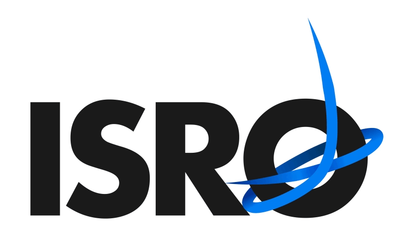
Present Logo

The Redesigned ISRO identity. The "O" here represents the earth and the swoosh is the representation of the orbital motion of the satellite and the motion of a space craft leaving Earth's orbit. The "O" can be used with ISR and also can be used alone to create an iconic identity for the organisation.
In the process of redesigning the identity of ISRO, it was important to keep in mind the ambitions and mission of ISRO. With a satellite in Mars’ and Moon’s Orbit, ISRO is now looking forward for manned space mission and are becoming global leaders in space exploration.
Having said that, launching satellites and putting them into the Earth’s orbit remains the main function of the organisation. So, while ISRO looks towards the dark of the space, it puts equal effort into developing state of the art satellite solutions for India and other countries as well.
In the identity, the letter “O” was emphasized. It was designed so that, the “O” can function as an identity alone, as well as a part of the word ISRO. So, in the identity system, “O” symbolises the earth, and the swoosh is the representation of the satellite’s orbital motion, and the ambition of the organisation to reach further into space.
The “O” alone can function as the identity, and also with the letter “ISR”
to become a logo type as well. Furthermore, the identity, in certain
collaterals and situations, can be used with a dark blue background,
which symbolizes the dark of the space.
Once the identity was done, the stationary was designed. While designing the stationary, it was assumed there would be no budget restrictions, so full page colour letterheads and other collaterals were suggested to enforce the brand language. The collaterals are shown below.

The Earth + Orbital Motion + Ambition to reach further into space
“...the identity should be iconic and easily recognisable, unique to ISRO. It should convey that ISRO is now moving further from just making satellites, to an agency which is keen to explore the farthest reaches of space, which it plans to in the coming years.”