UI-UX / CLASSROOM PROJECT
Stella is a concept for a mobile application targeted towards amateur astronomers, casual stargazers and almost anyone who likes to look towards the heaven in curiosity.
Stella is essentially a star map which is equipped with features such as Dark Sky Locator, Celestial Alarm Clock and Event planner. Apart from helping users sail the skies better, Stella also contains a celestial dictionary which helps them be more informed on their expeditions.
This application was developed over the period of 4 weeks and the processes included persona studies, card sorting activities, questionnaire, surveys and wire frames.
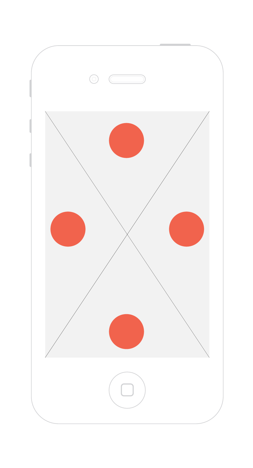
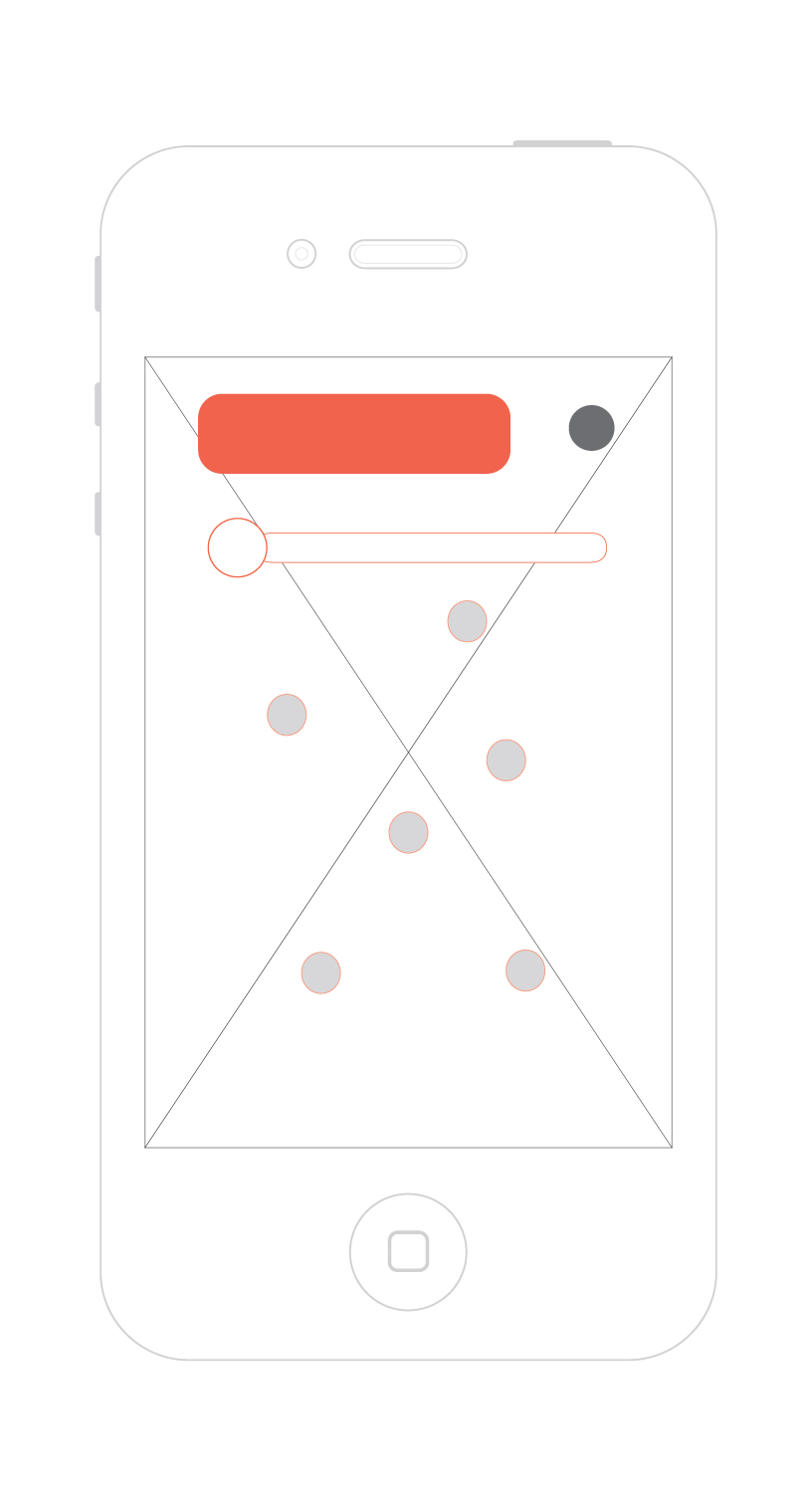
The application opens up with a star map. You can point the camera towards the skies and the map would show you which celestial body is in your field of view. You can pan across the sky and the sky map would move with you.
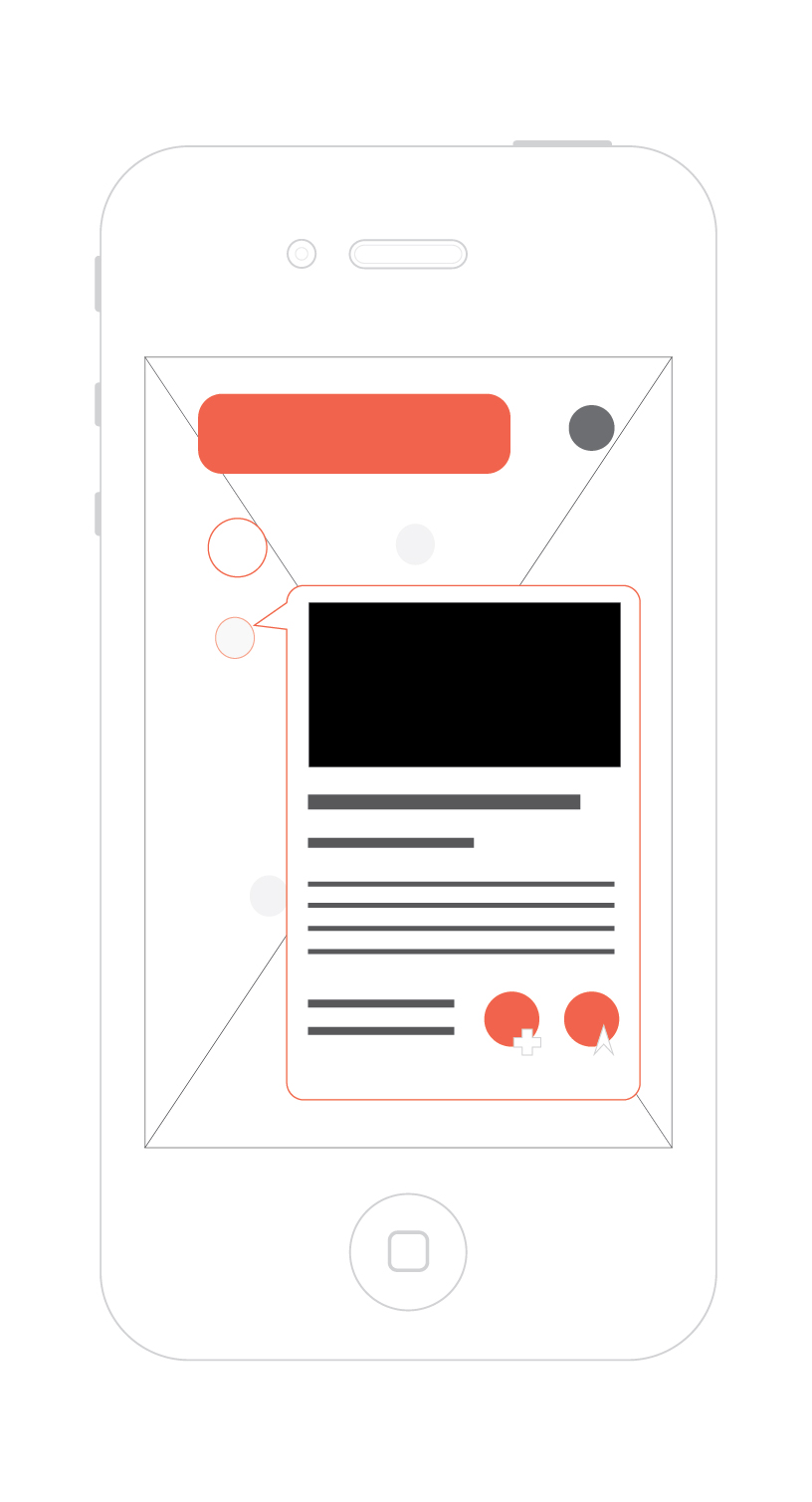
The stars and constellations will be highlighted and the size of the star circle would be proportional to the brightness of the star, i.e., the brighter the star, the bigger it is on the screen. Along with stars, you can also see planets, comets, satellites and other celestial bodies.
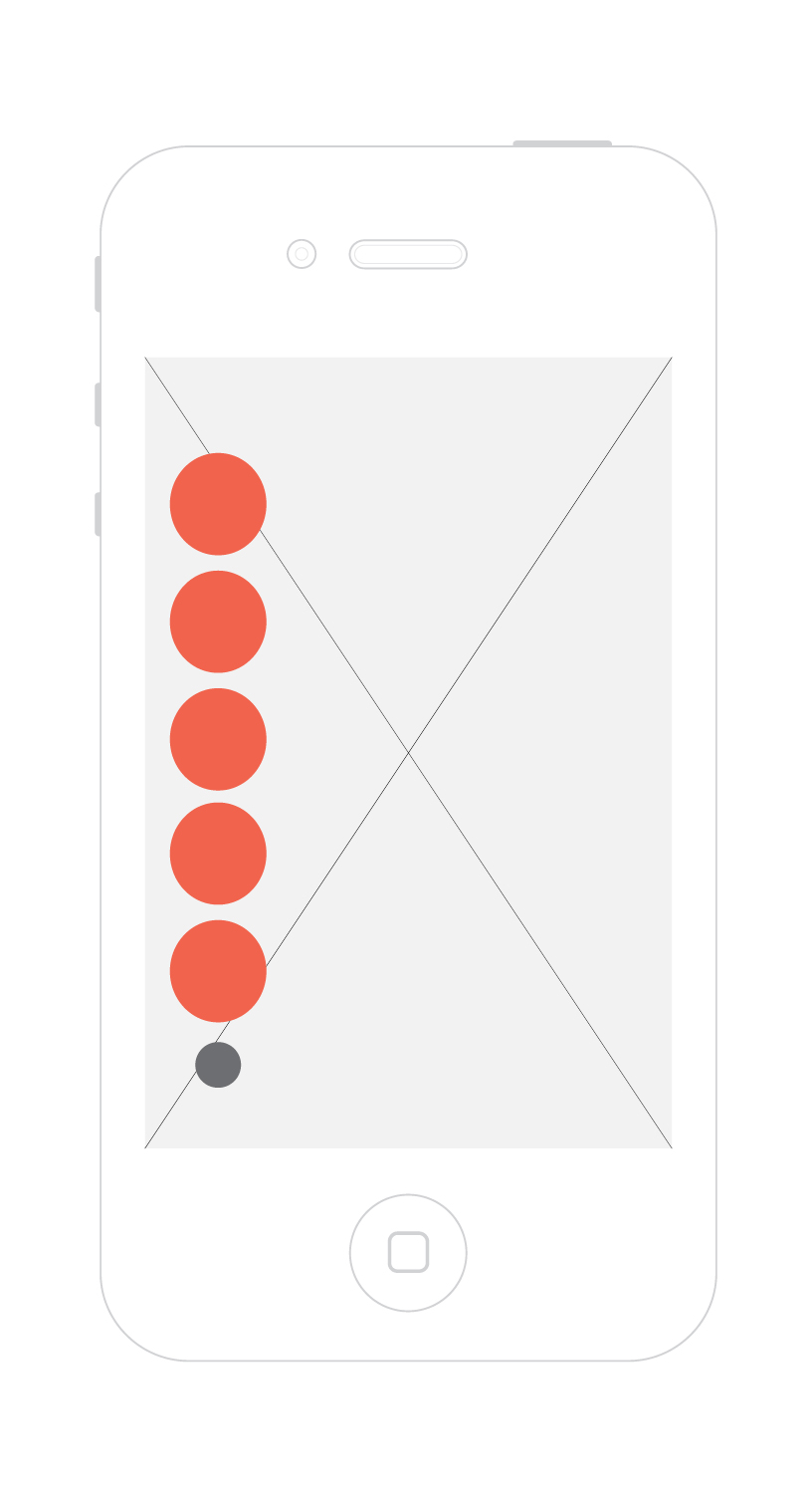
All the menus would reveal at double tap of the screen, and would then have tools that a stargazer would find handy during his stargazing trips.
On double tapping the star map, the main menu of the application appears. From this menu, you can access the Planner and Dictionary along with useful tools such as dark sky finder, search celestial bodies, filter options and more.
On the first launch of the application, the user will be given a quick demo for navigation in the application. This will help user get familiarized with the whole application and all the tools that it has to offer.
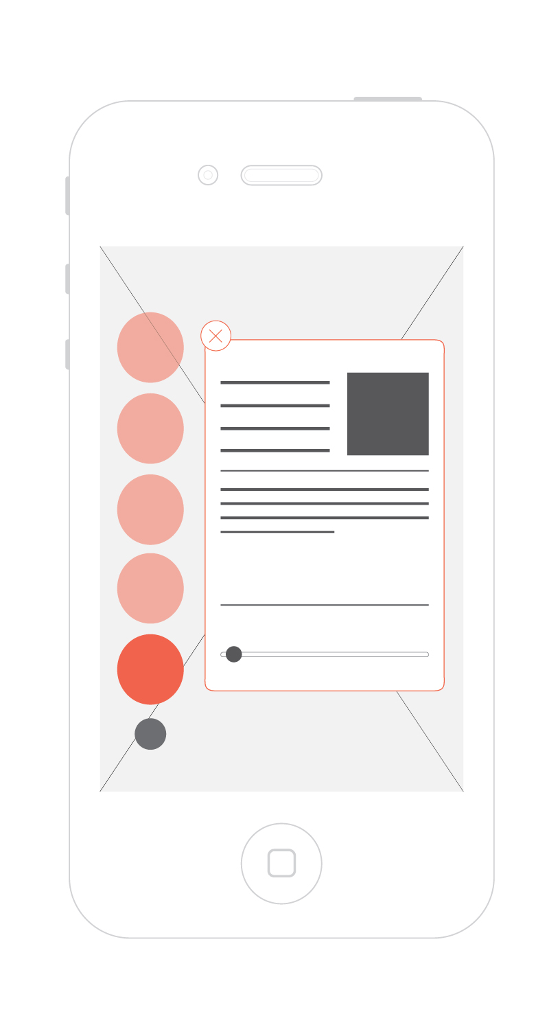
The above screen shows features such as weather forecast. With the slider on the bottom of the weather page, you can see weather forecast for up to six hours in the future.
The second screen shows the night mode of the app. This is a very important part of the app. In dark conditions, the pupil of the eye gets dilated to absorb maximum amount of light possible. But using phone during such conditions make your pupil contract and close up, hence reducing your night visibility. The colour red chosen in the night mode helps reduce this effect so that you can use the map when you're stargazing without losing your night vision.
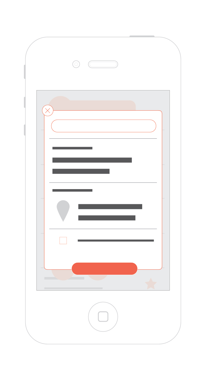
One of the unique features of this application is planning for a stargazing trip in advance and saving it so that you can access it later offline. This would be ideal for stargazers who travel to remote places in search of dark sky spots. Such locations might not have a mobile connection. So, with Stella, you can plan for a trip in advance and save it to access offline later.
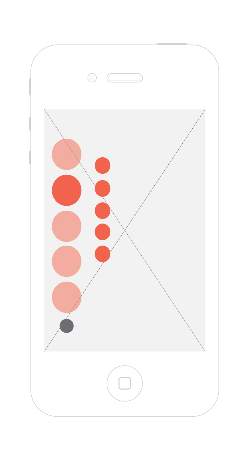
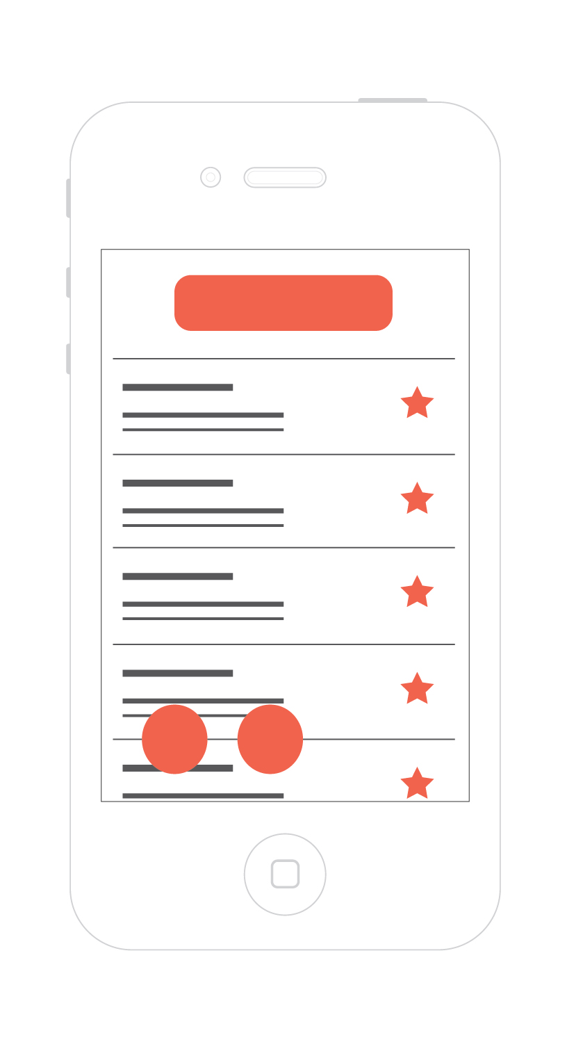
The Plans can be accessed from the main menu. The Plans menu would have your last 5 saved plans and buttons to add, remove or edit existing plans.
RESEARCH AND DESIGN PROCESS
To develop the application it was important to understand the users and their persona. We made a questionnaire and send it to the app's target groups and on the basis of that we build a rough outline of what the users need and how will the app help them. After the questionnaires and conceptualization, we did card sorting with our user group to design the information architecture of the application. After two weeks of surveys, persona studies and numerous card sorts, we started working on the screenshot for the app.
The questionnaire used for the survey can be found here. The results and its analysis can be found here.
INFORMATION ARCHITECTURE
Click to englarge
WIREFRAMES
